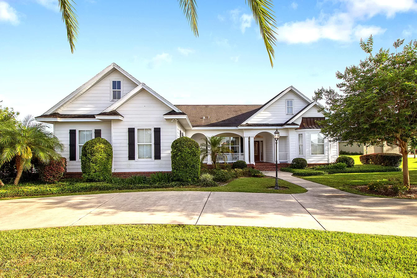
Fresh deck painting ideas change the way your home looks from the street in a single weekend. A clean color, crisp edges, and a smooth finish make your outdoor space feel well-maintained, which instantly boosts curb appeal.
You will find bold colors, classic neutrals, patterns, two-tone pairings, budget options, and modern looks. You will also receive simple steps for preparation and care, ensuring your finish holds up in Inverness, FL, weather, as well as nearby Citrus and Marion county conditions.
Bold Color Choices For Decks
Deep navy gives a clean, upscale look, especially next to white siding, light gray exteriors, or soft coastal tones. Forest green looks natural beside stone, brick, and warm stucco, plus landscaping looks richer next to green. Deck paint ideas like these stand out from the street without looking loud.
Rich red fits cottage, farmhouse, and traditional homes with beige or cream exteriors. Charcoal works with white trim, pale blue siding, and modern lines, plus charcoal hides dust and scuffs better than many light shades. As exterior finish pros, we see dark shades look sharp when rails and posts stay simple.
Bold color works best on a larger deck or a home with neutral siding, since the deck becomes a clear focal point. If your home already has strong shutters or a bright door, stick with one bold surface, then keep the rest calm. A clean color plan keeps curb appeal high at first glance.
Neutral And Classic Deck Colors
Neutral tones stay timeless, sell well, and fit almost any style. These shades also age well in Florida sun when prep and product choice stay strong. For paint ideas for decks, start with one of these reliable picks.
- Crisp White: Bright and fresh for coastal, cottage, and farmhouse styles, especially with black lights or dark hardware.
- Warm Beige: Soft and welcoming for stucco ranch homes and sand-toned exteriors common around Dunnellon and Inverness.
- Soft Gray: Clean and modern for homes with white trim, cool stone, or darker roofs.
- Greige: A balanced mix of gray and beige that matches almost any exterior palette without clashing.
- Muted Taupe: Subtle and polished for brick, earth tones, and traditional homes where you want the deck to blend in.
Patterned And Stenciled Deck Looks
Patterns add personality without changing boards or rail lines. A pattern also draws the eye to the deck, so the front of your home feels styled, not plain. Try one of these looks for curb appeal with a custom feel.
- Geometric Tile Stencils: Place a tile pattern near the entry or seating zone for an upscale, finished look visible from the walkway.
- Chevron Borders: A simple chevron edge frames the deck, which makes the whole surface look straighter and more cared for.
- Faux-Rug Center Designs: Paint a “rug” shape under a bench or small table so the space looks staged and welcoming from the yard.
- Striped Planks: Use wide stripes along the length or width to change how the deck reads from a distance, which helps the space feel larger.
- Medallion Focal Points: A centered medallion near the door turns the deck into a feature, which lifts first impressions fast.
Two-Tone And Color-Blocked Deck Looks
Contrast brings structure, and structure reads as quality from the street. A two-tone layout also guides the eye toward stairs, rails, or an entry zone. Use one of these pairings to add definition without going overboard.
Dark Railings With A Light Deck Floor
Pair charcoal or black rails with a light floor in soft gray, warm beige, or muted taupe. The rail line frames the deck, so the space looks sharper from the curb. Our field notes from Citrus and Marion county jobs show this pairing also hides wear on rails while keeping the floor bright.
Contrasting Stair Risers
Keep treads in one steady color, then paint risers in a lighter or darker shade for clean contrast. White risers with a gray floor look classic, while charcoal risers with a beige floor feel modern. Most clients tell us stairs look newer right away with this small change.
Border And Center Color Split
Paint a darker border around a lighter center to create a built-in frame. Try greige in the center with charcoal on the edge, or warm beige with deep navy for a bolder look. Sharp tape lines make this style look crisp from the sidewalk.
Matching Trim To Deck Accents
Repeat your trim color on deck accents such as post bases, rail caps, or stair risers. Black shutters pair well with black rail caps, while white trim pairs well with white risers and post details. This repeat ties the deck to the house, so the exterior feels cohesive.
Alternating Plank Colors
Alternate two close shades such as light gray and medium gray for a subtle pattern. This look suits larger decks where the design has room to breathe. Our advice as deck paint pros is to keep contrast mild so the surface stays calm, not busy.
Budget-Friendly Deck Updates
A single-color refresh gives the fastest visual change for the lowest cost. Pick one solid shade, keep the sheen consistent, and focus on smooth coverage. With years of hands-on deck work in Florida heat and humidity, we recommend spending more effort on cleaning and patching than on fancy add-ons.
Accent-only painting saves time and paint while still lifting curb appeal. Paint rails, posts, stair risers, or a border, then keep the floor in a simple neutral. This approach works well when boards look decent but details look worn.
Leftover paint projects work best on small areas such as a stencil zone, a planter box, or a rail accent. Match sheen levels so the finish looks even, and avoid interior wall paint on walking surfaces. Smart planning keeps costs down while the final look stays polished.
Modern Deck Finishes For A Sleek Look
Matte black decking looks bold, clean, and modern, especially next to white siding and simple landscaping. A matte finish also hides small glare marks in bright sun, which helps photos look sharp. This style fits newer builds as well as older homes with modern light fixtures.
Monochromatic schemes use one color family across the floor, rails, and stairs. Layered grays or layered taupes create a calm, updated look without strong contrast. Clean edges and straight lines matter most with this style, since the eye spots uneven borders right away.
Minimal palettes photograph well for listings and social posts. Stick with two tones at most, then add warmth through wood furniture or plants instead of extra paint colors. A modern deck look often raises buyer interest since the exterior feels fresh and move-in ready.
Your Perfect Deck Color Is Waiting
You now have bold shades, timeless neutrals, playful patterns, crisp two-tone layouts, budget updates, and modern finishes, all designed to lift curb appeal with a smart paint plan. Pick one idea, set a date, and start with solid prep so the finish looks clean from the street.
If you want a smooth, low-stress project in Inverness and across Citrus and Marion counties, reach out to Make-It-Happen Painting for a free color consultation and a no-surprise pricing guarantee.